What is your thought process for designing a thumbnail?

Kan

Superman
Freedom! Member
Jan 4, 2014
6,926
1,891
29
Metropolis
www.youtube.com
YouTube
AndrewKanFilm
Hello Freedom! Family,

I wanted to know, what is your process when you design a YouTube thumbnail? What goes through your head? Do you design your own, or do you get someone else to do it? I personally design all of my thumbnails, and find it just as enjoying as creating the original video!

I try to focus on an interesting moment from that video and highlight it well!

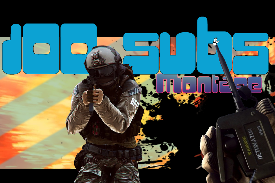
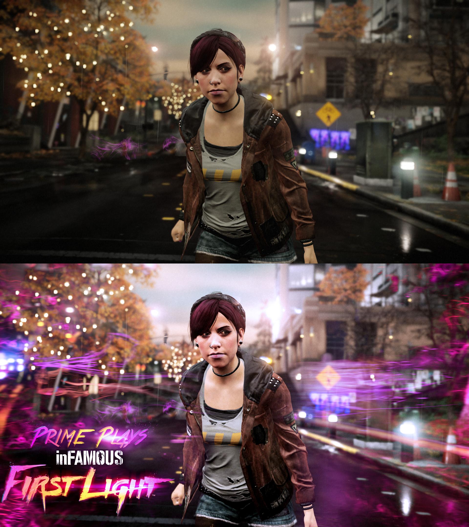
Here is one of my recent thumbnails:

LPME4.png

It's obviously from Mirror's Edge if you look at the top right. I Grabbed this because if I am a viewer I notice right off the back the gun. Why is she holding it? Who is she? Where is she from, then I see Mirror's Edge, let's say I don't know that's a game, I would be interested. I click on it and see gameplay and wonder, ok where does this happen?

It helps knowing what they think, as a viewer they may see the number 4, and be more confused and check out number one, they see this and wonder, what lead to this point? Who is she shooting? Why? Will she shoot?

When you get them asking questions they are more likely to check out your videos/channel.

That is what I have learned!

Let me know what you have, and let's have some great discussions!
 

Kratos Aurion

You Earnestly believe you could defeat me?
Freedom! Member
May 8, 2014
2,445
1,079
31
Phoenix, Arizona
YouTube
I just take whatever image that looks best and use that as my series thumbnail. Sometimes I'll use two thumbnails if I think it's appropriate and change it after a certain point in the plot happens. I try not to make it complex but also try to make it stand out as much as possible since I know people are more likely to click if it pops out at you.

Here are some examples of thumbnails I have used in the past. Pretty basic but I think they get the job done when it comes to standing out.

1 thumbnail series.

(Last series I finished)
Arcadia 1.jpg

(Current Series)
Ace 1.jpg

2 thumbnail series

(Used this at the start)
TOA 720p.jpg


(Used this after a certain plot point)
TOA After Short Hair.jpg

And just a sneak peak at something I'll be using for an upcoming series :) I try to go for stuff that is bright and has standout colors as you can see from these 5 examples.
Zestiria 720p.jpg
 
Last edited:

Kan

Superman
Freedom! Member
Jan 4, 2014
6,926
1,891
29
Metropolis
www.youtube.com
YouTube
AndrewKanFilm
I just take whatever image that looks best and use that as my series thumbnail. Sometimes I'll use two thumbnails if I think it's appropriate and change it after a certain point in the plot happens. I try not to make it complex but also try to make it stand out as much as possible since I know people are more likely to click if it pops out at you.

Here are some examples of thumbnails I have used in the past. Pretty basic but I think they get the job done when it comes to standing out.

1 thumbnail series.

(Last series I finished)
View attachment 11739

(Current Series)
View attachment 11740

2 thumbnail series

(Used this at the start)
View attachment 11741


(Used this after a certain plot point)
View attachment 11742

And just a sneak peak at something I'll be using for an upcoming series :) I try to go for stuff that is bright and has standout colors as you can see from these 5 examples.
View attachment 11743

Thank you that makes a lot of sense! I think the consistency thing there is very awesome too! Also choosing bright colors can work! If it's a bright game... XD Don't think we should put bright colors on a horror game, that goes into how color makes us feel and there is a lot we can say about that, but you noticed brighter thumbnails bring people in too! That's awesome! :)
 
  • Like
Reactions: Kratos Aurion

VigilantWasHere

Active Member
Freedom! Member
Aug 14, 2014
54
12
30
YouTube
VigilantWasHere
I agree with interesting moments 100%. Here is what I have for part 3 of my friend and I's Let's Play of Doom 3. He and I like this one the best out of the ones I have done so far. I think faces help to draw the eye to your thumbnail. :)Doom 3 Part 3.jpg
 

Kan

Superman
Freedom! Member
Jan 4, 2014
6,926
1,891
29
Metropolis
www.youtube.com
YouTube
AndrewKanFilm
I agree with interesting moments 100%. Here is what I have for part 3 of my friend and I's Let's Play of Doom 3. He and I like this one the best out of the ones I have done so far. I think faces help to draw the eye to your thumbnail. :)View attachment 11745

Definitely caught my eye! Only thing is sometimes too many faces can confuse me, for example the bloody skull was enough to catch my attention, but the other two confused me. Maybe it's the fully human one or the color on the overlay with all the text, but something is a bit cluttered on this. I like it though and definitely caught my eye, but it hurts my eye if I look to long XD I hope that makes sense.
 

VigilantWasHere

Active Member
Freedom! Member
Aug 14, 2014
54
12
30
YouTube
VigilantWasHere
The stuff I make always seems to get that response... the whole eye hurting thing. The human guy is a little of a in joke I guess you could call it, I do share what you think of it tho. It's a bit out of place. Here is my Youtube banner, people say it's painful on the eyes. I agree, but I like to think of it's kinda like looking into the sun, absolutely beautiful but you'll regret doing it.vigilant_was_here_at_freedom__by_vigilantwashere-d8lhctt.jpg
 

ThInKk12

New User
Freedom! Member
Oct 11, 2015
8
10
35
Canada
www.youtube.com
YouTube
I'll be real.. I get pretty stoned turn music up and escape.
 

Hail Kira

Game Show Host
Freedom! Member
Feb 5, 2014
5,541
2,226
40
British Columbia
YouTube
I try and pick a moment from the episode that I like, and i think would make a good thumb, and I usually crop it, so it doesn't look like a 'generic' thumbnail...

Though when I upload from my mobile there is no thumbnail option, so I just end up with standard thumb that youtube picks...
 

Kan

Superman
Freedom! Member
Jan 4, 2014
6,926
1,891
29
Metropolis
www.youtube.com
YouTube
AndrewKanFilm
I try and pick a moment from the episode that I like, and i think would make a good thumb, and I usually crop it, so it doesn't look like a 'generic' thumbnail...

Though when I upload from my mobile there is no thumbnail option, so I just end up with standard thumb that youtube picks...

I believe it however, I am happy YouTube is trying to fix the default ones though! :)
 

Phil Kidd

Human Person
Freedom! Member
Dec 10, 2014
1,287
637
Ottawa
YouTube
Really great thread! I see a lot of lackluster thumbnails out there, and though I'm not as good a graphic designer as @Bee I think I've made some very clickable ones.

I try not to duplicate too much text in the thumbnail from what's in the title. People generally see the title and thumbnail at the same time, so I usually just have 1 or two keywords in quite large font, and slightly skewed to draw the eye in. If the text isn't skewed, then I try to do something with the imagery to create the illusion of activity and action. I usually go with a colourscheme that suits the mood of the video; same goes for background saturation/textures.

Here's my most recent one for an upcoming video:mechanics6.jpg
 
  • Like
Reactions: Kan

Kan

Superman
Freedom! Member
Jan 4, 2014
6,926
1,891
29
Metropolis
www.youtube.com
YouTube
AndrewKanFilm
Really great thread! I see a lot of lackluster thumbnails out there, and though I'm not as good a graphic designer as @Bee I think I've made some very clickable ones.

I try not to duplicate too much text in the thumbnail from what's in the title. People generally see the title and thumbnail at the same time, so I usually just have 1 or two keywords in quite large font, and slightly skewed to draw the eye in. If the text isn't skewed, then I try to do something with the imagery to create the illusion of activity and action. I usually go with a colourscheme that suits the mood of the video; same goes for background saturation/textures.

Here's my most recent one for an upcoming video:View attachment 11747

That is very well thought out and I never include the title either, there is a slot for that so that was my logic. I actually really want to see the video, but I also feel the "TOP 5" mind or list mindset really drives people to watch. Look at buzzfeed's top 100 videos and post that does well :)

I think this really is a lot to take note from!
 

1SB2Gamer

Brabbit1987
Freedom! Member
Mar 2, 2014
2,846
1,020
37
YouTube
When I design my thumbnails, how difficult or in depth I go entirely depends on what graphics for the games I play are already out there.

In most cases, I will just look up wallpapers and use those for the background. After that I may add a little personalization to it, if I feel it's necessary. I will then add my overlay on top of that so anytime someone sees it, they will know exactly who it belongs to, assuming they already know me. I also use the same font for every single thumbnail, graphics, and even in the video.

Skyrim-E1.png

As an example, the above thumbnail for my skyrim series. I took the typical skyrim wallpaper, and then added my character from the game to personalize it. I felt the the half shadow over him, made his character a bit mysterious.
Since the series just started I have him wearing rags.

As the series goes on, I will be changing his facial characteristics to match the things he goes through. I will be adding little achievements to the thumbnail. As an example, once I complete the companions quests, I will mark the thumbnail somehow to show it.

Now other series, I may not do that sort of thing. I may just keep it the same all the way through. It depends on the game.

But for games like minecraft, right now I just have an image of my character in the game. The reason for this is because I am not far enough in yet to have anything to show. Once I start builds, I will use screenshots of the those builds as the background instead.

Minecraft-E1.png
 

TheAimGames

Renowned User
Freedom! Member
Apr 13, 2014
606
369
27
Where the sun doesn't shine
YouTube
I also use the highlight of the video for my thumbnail to try and grab the audience's attention. It so happens that I use the same scenario in the beginning of my audience to show what actually happened in the thumbnail. I believe this can attract their attention to the point where they want to know what's going on in the video


Bee

Chief Creative Director of Optimize Group Ltd
Freedom! Member
Apr 20, 2014
461
203
California
optimizegroupltd.com
YouTube
A lot of things go through my mind when I first tackle a design.. With thumbnails its even more challenging as I have to fit a big message into a very tiny space and make it so good that I can carry my message with the least amount of text and clutter possible.

The thumbnail I'm about to show you is a project that I was EXTREMELY excited to work on. I've been waiting to do it for a very long time and I'm happy I finally can! Its going to be my first step into the youtube gaming category on my personal channel.

To start off I had to pick the perfect image and in most case's Kan's method of pick the most amazing frame in your video is going to be the go to, luckily my game of choice comes with a photo mode :). I sat for about 30 minutes getting the exact pose I wanted and then used the games controls to position the camera and adjust depth of field. Of course no image is ever 100% perfect when shot so I then bring it into photoshop for color correction. For the image you are about to see I used a combination of Levels, Brightness/Contrast, Photo Filter and Vibrance. There is also a light amount of hue/saturation adjustment. Then after that I basically went and completely overhauled the shadows and highlights on the focus point (the character "fetch") My goal was to make her the star of the thumbnail which definitely happened. After this I began to hand paint in some neon as well as using a bit of neon from the game in the corners. After adding in the extra neon I placed in the game's title art and then recreated the title art for my show title "Prime Plays" this was done via 3 text layers, several layer styles, some blending modes and 2 layers of pink sparks.

This whole thumbnail project took approximately 6 hours this includes everything from capturing the original shot to hand brushing in some details to adding final adjustments to the text.

Best part is: I did this project high resolution so it can also double as a computer background which I am also using it for :)

 
  • Like
Reactions: Koala_Steamed

1SB2Gamer

Brabbit1987
Freedom! Member
Mar 2, 2014
2,846
1,020
37
YouTube
A lot of things go through my mind when I first tackle a design.. With thumbnails its even more challenging as I have to fit a big message into a very tiny space and make it so good that I can carry my message with the least amount of text and clutter possible.

The thumbnail I'm about to show you is a project that I was EXTREMELY excited to work on. I've been waiting to do it for a very long time and I'm happy I finally can! Its going to be my first step into the youtube gaming category on my personal channel.

To start off I had to pick the perfect image and in most case's Kan's method of pick the most amazing frame in your video is going to be the go to, luckily my game of choice comes with a photo mode :). I sat for about 30 minutes getting the exact pose I wanted and then used the games controls to position the camera and adjust depth of field. Of course no image is ever 100% perfect when shot so I then bring it into photoshop for color correction. For the image you are about to see I used a combination of Levels, Brightness/Contrast, Photo Filter and Vibrance. There is also a light amount of hue/saturation adjustment. Then after that I basically went and completely overhauled the shadows and highlights on the focus point (the character "fetch") My goal was to make her the star of the thumbnail which definitely happened. After this I began to hand paint in some neon as well as using a bit of neon from the game in the corners. After adding in the extra neon I placed in the game's title art and then recreated the title art for my show title "Prime Plays" this was done via 3 text layers, several layer styles, some blending modes and 2 layers of pink sparks.

This whole thumbnail project took approximately 6 hours this includes everything from capturing the original shot to hand brushing in some details to adding final adjustments to the text.

Best part is: I did this project high resolution so it can also double as a computer background which I am also using it for :)


It's amazing the extent you went to make that thumbnail, but that many details I believe are entirely unnecessary and on top of that the text on the image is way to small.

The main reason I don't go to a crazy amount of work on my thumbnails and keep them pretty simple is because that much work isn't going to have any effect once it's actually used as a thumbnail. All that work will simply be lost. No one is going to notice it. Those awesome neon effects are going to look more like pink blotches.

lowerres.png

Here is the way most people are going to see it while on youtube. You can hardly even read Prime Plays at first glance. When making thumbnails, it's important to keep in mind that it is a thumbnail, not a wallpaper.

Now don't get me wrong, the thumbnail is still great, I like it. If it had bigger text it would be even better. However, 6 hours of work ... it's not worth it. Course, if you have the time, then by all means lol. At least that is just my opinion.